
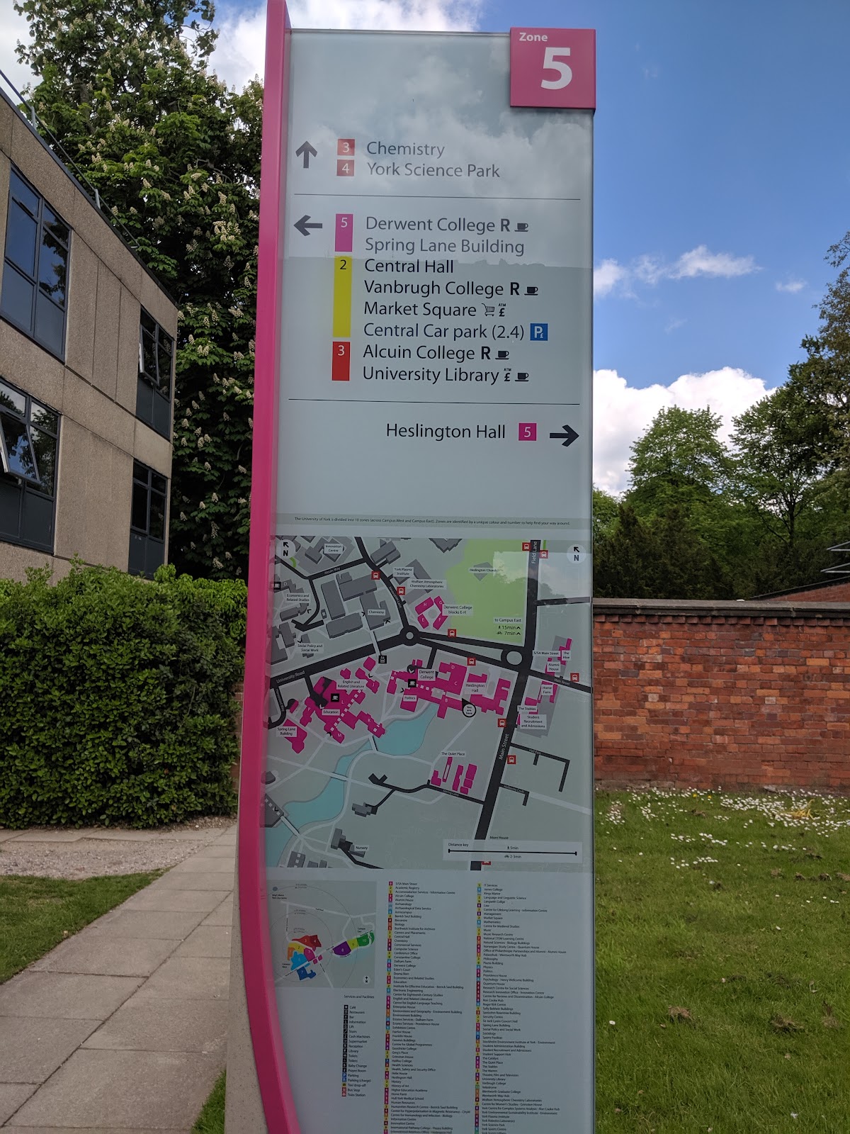
The concept of zones was introduced to campus last year, when new signage was put up that divided campus up into ten coloured areas. This was done as part of the University’s Wayfinding and Signage project.
Last month we launched an updated version of our online map, which now uses the same zone system and brings the two types of map closer together. We’ve hopefully made it much easier for staff, students and visitors to use the physical and digital maps together as they navigate around campus.
Starting the project
In April of this year the digital team met with the Wayfinding and Signage project manager. This helped us to get a better understanding of the background to the zones concept, and gave us some ideas about how we could translate some of the ideas from the physical signs into the online version.
We allocated some time to work on this in time for our June Open Days. Open Days are peak times for lots of new people arriving on campus (and getting lost) and hence using our maps, so this was going to be a good time to test out the new concept.
Sketching out a concept
Before diving into code, we spent a couple of hours using just paper, Sharpies and sticky dots to help us figure out what we were going to build.
We started with Crazy 8’s. This is a timed exercise where each person folds an A4 piece of paper into eight, and has eight minutes to individually get down as many ideas as possible. When the timer is up, we talk through our ideas and then dot vote on the ones that have the most potential.
Next, we each produced a solution sketch, where we spent a bit more time fleshing out some more of the details. Here we were considering things such as what would happen when a user searches for a location, or opens up a panel to show more information.

After a bit more discussion, we had an agreement about what we were going to do, and it was onto the next stage.
Changing the map colours
Our existing map already used quite a few different colours – various greens for different types of outdoor spaces, and a strong blue for the campus lake – so just adding extra colours on top wasn’t going to be practical. Some of the zone colours would have been difficult to see, and the whole thing would end up looking very busy.

Instead, we simplified the underlying map, going for a lighter and mostly monochrome palette, with the exception of the lake.
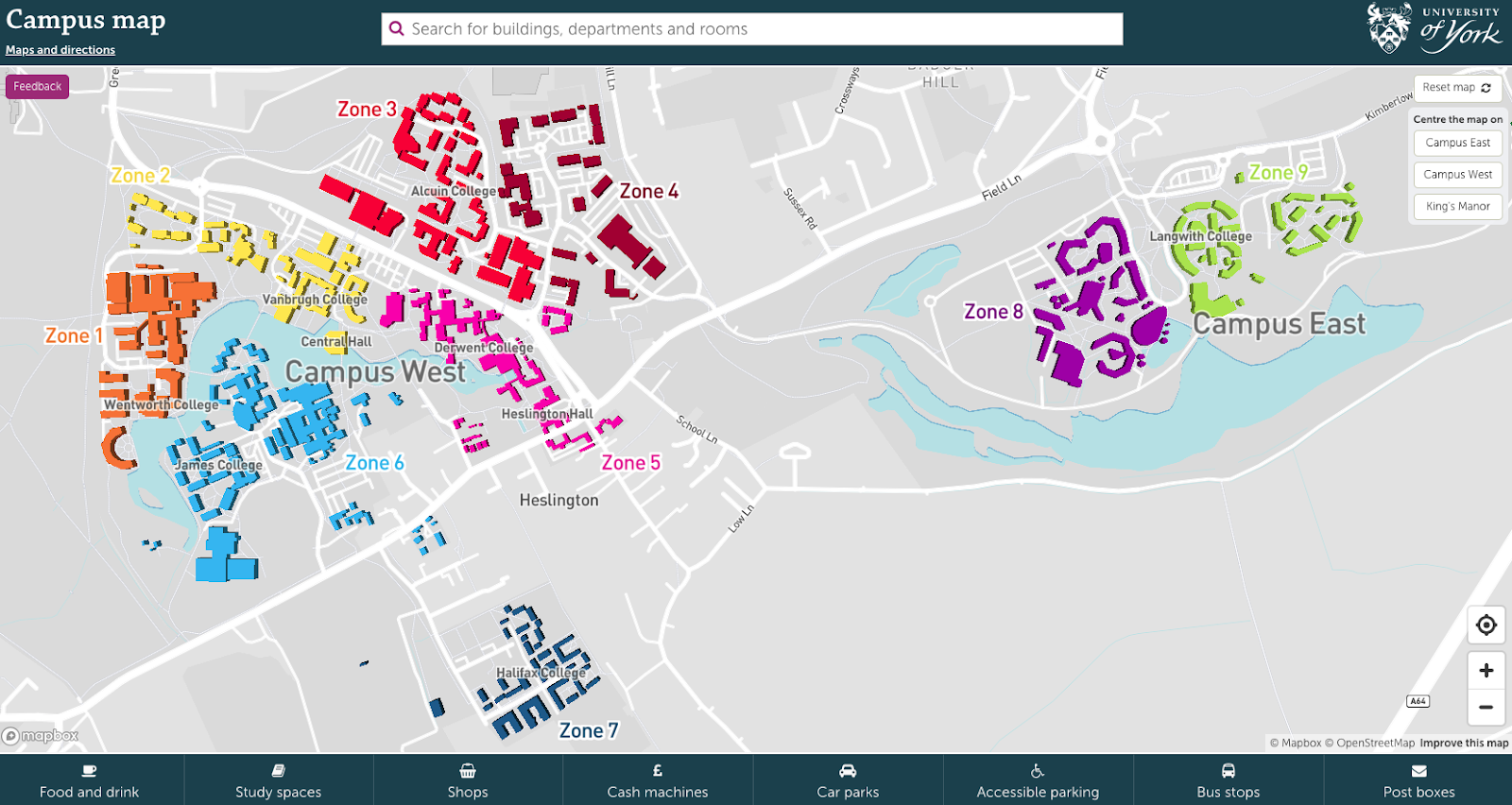
Nick did all this using Mapbox Studio, with some scripting magic to figure out which zone each building belonged to and hence how it should be coloured.
Map search and information panels
As well as colouring the buildings on the map, we decided to also include the zones in the map search and information panels. This was to both reinforce the concept of zones, and to make it easier to see the zone at a glance.
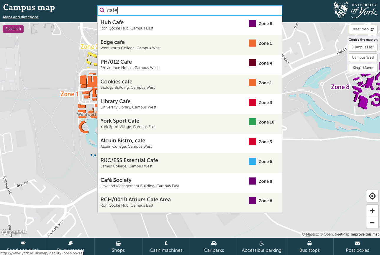
Zones can be easily seen in search results
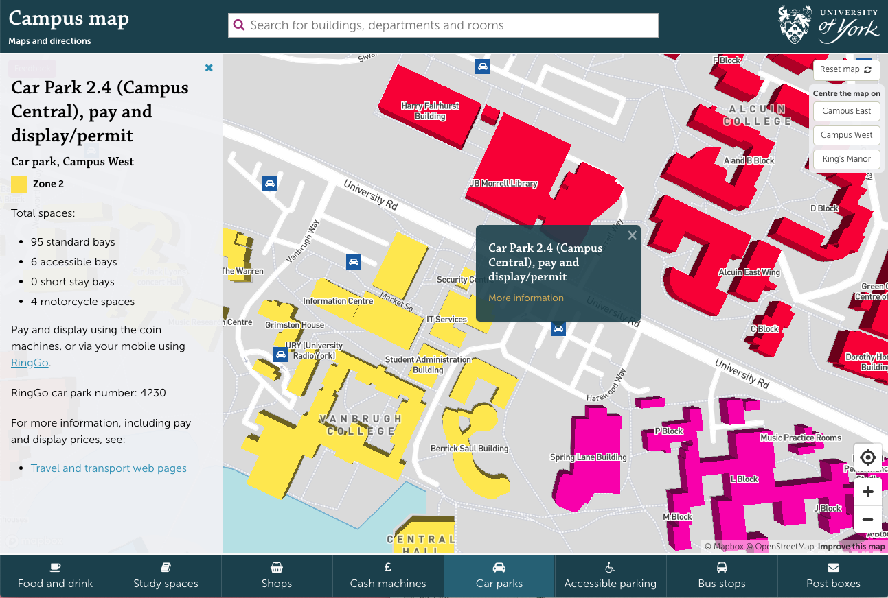
Zones are also shown in information panels
Dave worked through several iterations of how best to get the zone colours, text and background colours working together, taking into account usability testing findings (see below) and accessibility considerations.
Usability testing
Once our prototype was ready, Aimee and Nick headed out to do some ‘pop-up’ usability testing. They set up shop in the Library foyer, and asked passing staff and students to carry out a series of tasks on the map, using both laptops and mobiles.
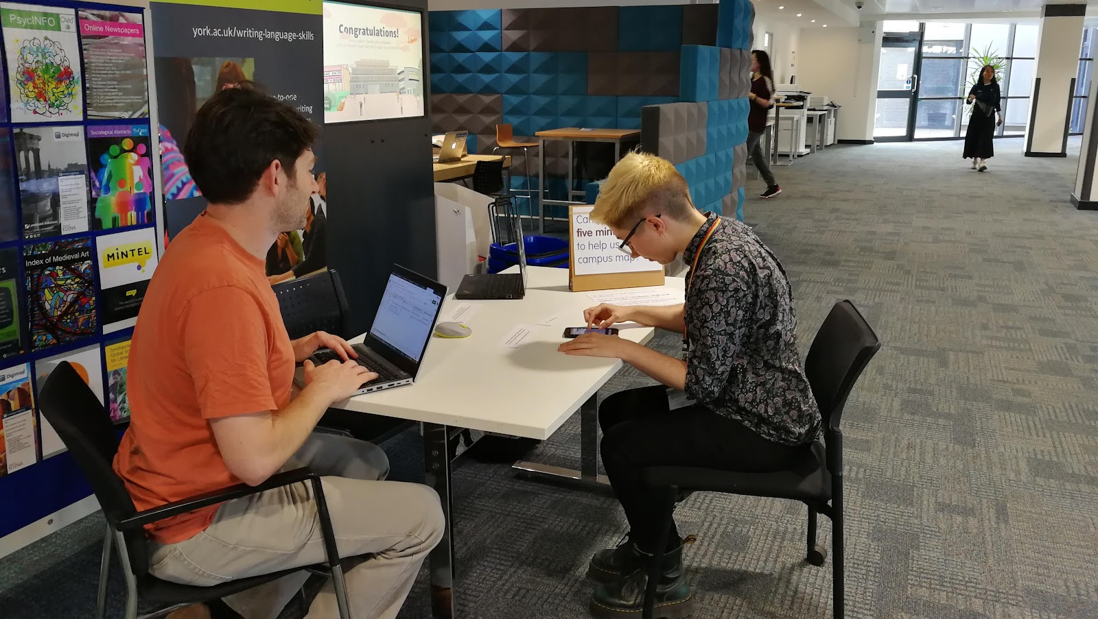
Nick observing a member of staff using the map prototype on a phone.
This gave us a few issues to fix, but overall went down well.
Other changes
- The icons used online are now closer to the icons on the physical maps, and use the same colours.
- All college blocks are now labelled, which had previously been a bit hit and miss.
- Car park names were updated to match the naming convention used on signage (eg “Car Park 2.1”).
The finished product
After a pilot using a custom version of the map for June Open Day visitors, we launched the full version of the map in July.
Try the new map for yourself and let us know if you have any feedback.