
Earlier this year we had the opportunity to consolidate two printed publications aimed at prospective international students. This was a really satisfying piece of work as we’ve made significant improvements in terms of content and design.
Content everywhere!
Better copy, images and design wasn’t the highlight for us (although it’s important and they look great!). What we enjoyed most was that we got to practice the ‘content chunking method’. Essentially this means re-purposing content so that we give a consistent message to our audiences, and make content easier to update and reuse.
With so many publications and digital channels aimed at prospective students…
We need content that can go more places, more easily. Rather than creating fixed, single-purpose content we need to make content more future-ready, flexible, reusable, manageable, and meaningful wherever it needs to go.
Content Everywhere, by Sara Wachter-Boettcher
Purpose of the guides
Both guides are used as a recruitment tool to encourage prospective international students to choose York. There are a lot of crossovers in terms of general information about the University, city, campus, student support and so on.
Guide for international students
- Aimed at prospective international undergraduate and postgraduate students who wish to pursue a full degree at York
- It’s used at study fairs and events around the world
- It’s a mini version of the prospectus
- It’s used as a standalone publication (used instead of, not as well as, the prospectus)
- The International Recruitment team needs something which is smaller and easier to use overseas (compared to the bulkier prospectuses)
Guide for visiting students
- Aimed at prospective visiting students from around the world who want to come to York on an exchange. They could be here for a full academic year or less.
- It’s aimed at undergraduate and postgraduate students
The audit
We love a good content audit and it’s often where we start a content revamp project. We mapped out what content was in each publication and looked at where there were similarities or differences. We looked at what content we could and couldn’t consolidate, and where we might need lots of caveats. From this we came up with these options:
- Option 1 – two publications
Keep two separate publications, but with the same front section overview about the University and the city. The second sections would have the tailored study information for either full degree or visiting students about course options, fees and applying etc. - Option 2 – one publication
Merge both publications into one, with a few options for how this could be structured:- A super slim mini guide for international students focusing mainly on ‘Why York?’ and driving people online for detailed study information like course and subject options etc.
- A chunkier guide with three sections including ‘Why York?’ and then separate sections for full degree students and visiting students
- A chunkier guide with two sections including ‘Why York?’ and a combined study section. The study section would have caveats where certain things might not apply or only apply to one type of international student.
What we did
We used the audit as the basis for a really good discussion with our colleagues from the International Recruitment team and the Centre for Global Programmes. Together we decided on the best solution for the audiences and how the publications would be used.
We decided it was best to continue with two publications, but to create them in a more efficient way (re-using general content across both). This enabled us to still provide clear, tailored study-related content for each audience. It probably sounds like an obvious approach! But this was the first time the Corporate team in Marketing would be working on both publications, so it was the first chance we had to make them properly consistent.
Content and design
Each publication has the same short ‘about the University / choose York’ section with the following spreads:
- Choose York
- City of York
- Campus life
- Support
- Accommodation (slightly different for each audience)
- Pre-arrival and arrival information (slightly different for each audience)
This content was based on our latest undergraduate prospectus and includes quotes from students. The work we did on the undergraduate prospectus last year meant we already had great, streamlined content that we could re-purpose.
We updated the look and feel to align with our other mini guides for prospective students, eg our mature student guide. Updating to this design meant we needed to cut the text down (and drive users online) and make more room for images and student quotes.
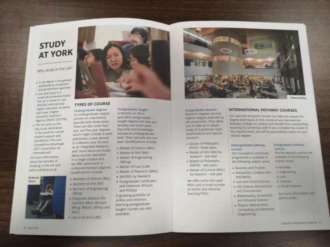
Here are a few sample spreads.


Each publication has a second section for study-related information, which is unique to each guide to suit the different audiences.
Keeping the two first sections as consistent as possible should make it much easier to update the guides next year!