Tactile resources and alternative formats
This is the second blog post about our efforts to find alternative formats to make teaching materials accessible to visually impaired students. Previously on this blog, Lilian’s blog post focused on the challenges of expressing different kinds of graphs in tactile formats, a common problem in supporting visually impaired students in STEM subjects. However the varied teaching at the university can present a wide range of resources which need rethinking in order to be made accessible to visually impaired students.
This blog post outlines examples of some of the issues which we’ve encountered and how we’ve tried to tackle these. Most online resources available for tactile resources are designed to support primary and secondary education. With increasingly specialist content as study progresses, there are few if any online resources available for some of the problems which arise and little guidance as to how to tackle these challenges. Hopefully the examples here might help staff and students encountering similar problems – but if you have answers to any of these please let us know! We’re very aware that we’re experimenting with formats and solutions, and we’re always learning more about what works and what does not.
Mapping uncharted territory
Maps present a perennial problem when needed as an accessible resource. One set of examples arose around a student taking medieval history courses. The primary content of the course was textual, with translations of original sources and passages from secondary courses as assigned reading. Maps weren’t the main resource used, but maps were used in these courses to support understanding of the movement of armies across Europe, the Middle East and North Africa. This isn’t unusual. Maps can provide easy visualisations of territories won and lost, changing national borders, emerging and changing trade routes, the locations of battles, the paths of armies, the spread of languages, diseases and more. However in most cases, the map isn’t necessary to the learning outcome. It helps the understanding of the topic, but the student is not expected to be able to accurately read a map or reproduce one for assessment, rather to discuss the events plotted on it. This was certainly the case for the medieval history courses – the maps were to illustrate the course of armies, but weren’t the primary resource for students. So how best to convey this information? The teaching was remote, so the resources needed to be digital. In this case, we recommended the tutor write short summaries of what she wanted to convey with the maps. Typically this translated to a brief description of the movement of the army, moving from a particular direction through territory, with dates and locations of battles noted. This gave the essential information but avoided lengthy descriptions which would add to the student’s cognitive load, whilst not actually adding useful information in terms of the course content.
However, the different use of the map in teaching can dictate the approach. Maps are a common feature in archaeology teaching and the scale can vary hugely – for example on a global scale indicating trade routes of materials, the plotting of similar sites and finds across areas at international, national or local levels, or site specific maps, marking finds across a particular dig. Location is effectively a data point for finds in such maps – but how can this be conveyed to a visually impaired student? The context of the map is important. What information does the student need to gain from it? In some cases a descriptive written outline, as used for the medieval history instance, may be sufficient, but elsewhere a tactile version may be more useful.
The photo below shows various approaches to the same map, which was part of the materials for a student workshop exercise. In the upper left, is a printed version of the map which provided the template for the example on the upper right. I traced the map from the printed version onto German film and then traced over the outline again on the geometry mat to create a tactile version of the map. The tracing is difficult due to the texture of German film, but this did produce a tactile map where both the dots and the lines were easily perceivable.
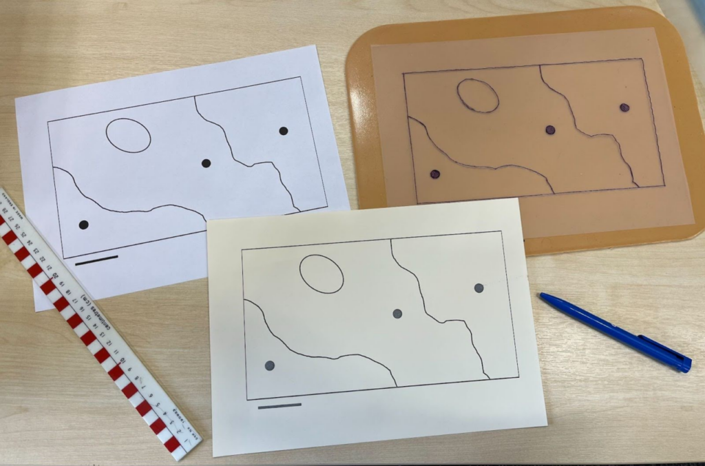
The target student studies in person, reads braille and has a PenFriend Audio Labeller, which opens up different options for tactile diagrams. On the map, different archaeological sites are marked with dots, whilst the underlying geology is indicated by lines on the map. I digitally edited the original version of map to enlarge and remove the text labels – labels could then be added back into the tactile versions either with braille tape (although as discussed in the previous post, this has a tendency to curl, especially if stuck on German film) or using PenFriend stickers. In the centre in the lower part of the photo is the attempt to print a tactile version of the map on Swell paper, using a heat emboss printer. We’re restricted to A4, which is limiting, as the lines need to be quite thick to create perceivable designs. The need for thick lines across a relatively small page limits the detail possible – as well as potential space for any braille labelling. This is a problem in creating diagrams for Higher Education study, as all the examples in the materials that accompanied the printer are designed for primary school use. I judged this design to be simple enough to be possible with the heat embosser, but the result was not very successful. The dots raised well – this was a pleasant surprise, as areas of solid ink often bubble, creating an unpleasant texture for students to work with. However the lines were too fine to be easily perceivable, so the map as a whole was not workable.
This example illustrates the issue of time put into these resources and how useful they might be. This map is for a single workshop exercise – it is not key content for the course. I considered trying to digitally re-edit the map to create thicker lines. The texture of the Swell paper means that the heavily inked the design, the greater the risk of smudging as it is printed – which in turn can make a print unusable. In this case, this was further complicated by the fact I was not working from the original diagram, so the digital editing was not as straightforward as it might be. Ultimately, I decided against it. In the standard workshop handout, this map takes up half an A4 page, as the basis of an exercise. This shows how much time and effort converting something seemingly small and simple into a meaningful and usable tactile resource (or alternative format of any kind) can take.
Experiments for archaeology- but not experimental archaeology
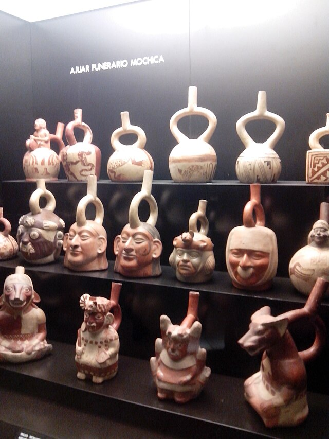
Archaeology teaching is also the source of the next example – from a workshop discussing morphology. One of the examples for the workshop was Moche stirrup spout vessels, a very specific style of pre-columbian ceramic. These pots have a looped spout above the pot and range from simpler forms, to surface decorated examples, through to complex pots in the form of heads, figures and animals. This image (used under Creative Commons, photo by Miguel Alan Córdova Silva) of a museum case of Moche stirrup vessels illustrates some of the range of forms, from the simpler vessels at the top, the head form examples on the middle shelf, to the full figures, including animal headed figures on the lowest shelf.
Thankfully the workshop was concentrating on the variation of the simpler forms but this still presented a challenge. The spout is in the form of a stirrup, thus the name of the pot – but how useful is that to someone with little to no sight? A stirrup is not a sufficiently familiar object to most people for that to be a meaningful descriptor. I thought that a model of the basic form might be a good starting point – if somebody can handle a model and understand the essential form and structure, they then have a starting point from which they can extrapolate what variations would be like.
My first thought was whether it might be possible to 3D print a vessel. At the University of York, I’m lucky to work in the same building as the Creativity Lab and YorCreate, so have access to 3D modelling and editing software, as well as 3D printers. Unfortunately even the simple forms of these pots would be complex to digitally model and beyond my very limited skills. However, the increasing availability of 3D models of artefacts from museums meant that printing still might be a possibility. Many museums are starting to make digital 3D models of items available through platforms such as SketchFab. Not all of these can be downloaded to print and not all are free, but it does open up possibilities for printing handling models of archaeological artefacts, which could be a great accessible resource.
Nevertheless, even with an existing 3D digital model, these are still complex items to print. More complex prints require printed supports – either built in from the same print materials and designed to be snapped or cut away from the final model, or printed in PVA, so the final print can be soaked and the PVA props dissolved away after printing. This makes designing the model potentially more complicated – which approach will you take? If it’s an unfamiliar form – and this was – you have less idea how this will print. Additionally, the printing would have needed infill – effectively creating a solid object (albeit the inside is typically printed a honeycomb rather than truly solid) rather than as a vessel. This could change how someone fundamentally perceived the object.
Whilst none of these are insurmountable challenges, they are complicated and they do take time to address. Time was not on my side – the materials were needed in just over a fortnight’s time. I do want to explore more 3D printing and building up a library of replica objects, but in this case, it was too complicated and too time consuming a solution.
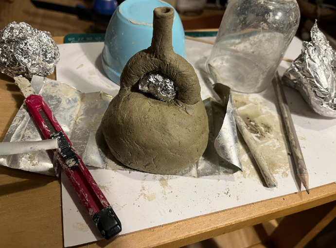
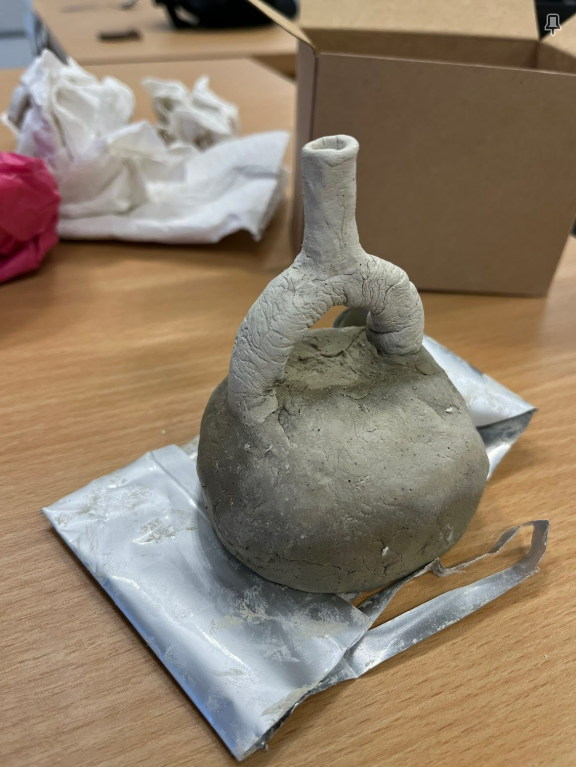
These are ceramic vessels. Whilst actually throwing a pot and firing it was not going to be possible in this time frame, air drying clay seemed like a possibility to create a small model of the basic stirrup vessel form. This had the advantage of being quicker than the 3D printing, could be created as a hollow vessel and whilst not the right kind of clay, air drying clay would be closer to the original ceramic in weight and texture than the light PLA plastic of the 3D printers.
So I bought some air drying hobby clay on my way home and that evening attempted to create a Moche style stirrup vessel. Whilst my favourite forms from the pictures I’d seen when searching for examples were the animal shaped vessels, I was again relieved that the session seemed to be on the morphology of the plain forms! Air drying clay is far stickier than clay otherwise used in ceramics, which made the modelling process challenging. There is a long tradition of experimental archaeology, with researchers trying to recreate artefacts to understand the techniques used. This was not that! As shown in the photo, I resorted to various modern aids unavailable to the Pre-Columbian potter, using existing objects like a glass as a mould for the vessel, using a craft knife and pencils as modelling tools and relying heavily on scrunched tin foil to create a prop for the arch of the spout as the vessel dried.
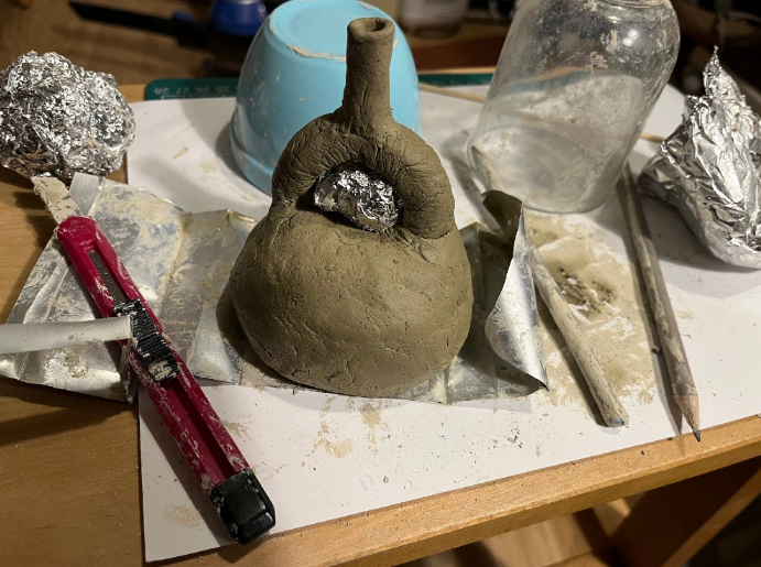
The attempt was moderately successful: I did manage to make something approximating the shape of the Moche stirrup spout vessels, it was a hollow ceramic vessel, I did manage to get this safely from home to campus without it breaking and it was allowed to fully dry out safely in the office, as pictured.
Was it worth it? I don’t know. This was a resource designed so that the student could more fully engage in a workshop, but I didn’t get feedback that it had been that useful. As a resource for a single workshop, this was a labour intensive solution. I think creating more models has potential to support courses in future, but less so for standalone workshops. Certainly more lead in time is needed, especially for 3D printing.
Decision trees – and leaves
The next examples are from trying to create materials to support a Biology project. The students were given a plant ID key to identify meadow plants, to enable them to establish the diversity of an area. The plant ID resource consisted of images of each of the plants, with a decision tree format of questions. The questions were designed to refer the user to different sections of the guide and eventually, through the questions, identify the plant. They could compare the specimen with the picture. The user was intended to skip to different bits of the guide, indicated by colour and letters. This is not an accessible resource for a visually impaired student – but how to create a meaningful alternative format?
A decision tree or flow chart process is not easily navigated by anyone reliant on a screen reader or magnification for access – even less so if they are complicated. The student who would be taking this workshop uses a screen reader. I decided that the best way to replicate the decision tree process in an accessible format for them would be to create an internally linked Google Doc. This could retain the questions and descriptions from the original source, but a hyperlink to each section would make it easier to navigate the source as needed, without requiring the user to jump about the source in the same way. I thought this would also enable the student to follow the same decision making process in identification that other students on the course would be following from the original resource.
This took care of the decision tree itself, but not of the use of diagrams within it to help the user identify the plant. These outline diagrams showed leaf placement and the leaf shape – effectively a visual glossary. Without this, it would be less clear to the user what they were being asked, when needing to distinguish between a cordate leaf, a palmately-lobed leaf or a bipinnate leaf. I created two resources to try to provide this information, one digital and one physical. The supporting digital resource was simple – a glossary of terms, written to describe things clearly and concisely, with as little visual bias as possible. The physical resource was a set of card leaf cut outs, designed to be a tactile way of conveying the shapes of different leaf shapes. These were a little cruder than the diagrams in order to be successfully cut from card and be usable – most notably the stalk of each leaf had to be reasonably thick. I cut these to have a square base at the end of the stalk, which was large enough to accommodate a hole punch, so the whole deck of card leaves could be joined together with a treasury tag.
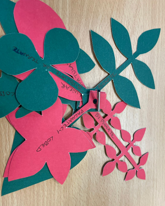
I labelled each leaf, but given the nature of the cut shapes, these were not really suitable for braille labelling. However the identification task was to be done in groups, so the student would have sighted colleagues who would be able to read the text and find the relevant leaves. This was a successful resource – feedback from the student was that it was helpful to be able to feel leaf shapes and that it also made it easier for other sighted members of the group to think about and identify leaf shapes.
Reflections
As Lilian discussed in the Tactile Graphics post part 1, not all resources need to be durable. Some handouts are designed for students to keep and refer back to as needed, whilst others are ephemeral, designed to provide information for specific workshop, activity or taught session, but not needed beyond that. It can be difficult to determine how much time and effort should be devoted to experimenting with accessible formats of what are essentially going to be disposable materials. Spending too much time on developing complex alternatives to materials which are intended as background to a workshop is not a good use of time which could be better spent on ensuring essential materials are accessible as possible – and can also distort the time management of the student, directing them to give greater attention to less consequential materials.
Cognitive load is an issue here. Are all ephemeral or transient materials necessary for the student to have as long term resources? It is harder for visually impaired students to distinguish between materials, which can lead to materials intended for short term use being conflated with long term resources and given as much attention, which ultimately risks distracting the student from the more important materials. Looking at the learning outcomes, both for individual sessions and for modules as a whole, can help ascertain which materials are essential to support the student. Considering what exactly the student is required to do whether at a workshop, a course or an assessment level can determine which materials are required to achieve this, and which might be considered more as background or as not strictly necessary to achieve the learning outcomes.
The main lesson which I have taken from all of this, is that context is critical. When resources are supplied by a lecturer with a request to “make them accessible” but with little information about the session, it can be difficult to work out the importance of each resource for the seminar or workshop. Getting the emphasis right, as to which resources to prioritise, how durable alternative formats might need to be and even how the resources might need to be used, all requires some awareness of the context in which these resources are intended to be used. Understanding how resources are intended to support teaching is critical to this. So, materials aside, I think creative thinking and contextual awareness are the most important elements to produce meaningful tactile resources.
Related posts
Creating Tactile Graphics for VI students – part 1
Creating Tactile Graphics for VI students – part 3
Reflections on our Supporting visually impaired students workshop.
Excellent. Very formative, lots of ingenuity
I wonder if it would make sense for us to have a national database of ideas / resources for tackling these things – so you could type in a key word and get an idea or downloadable resource. I know there are 3D printing libraries already.
That’s a great idea! Part of the reason we’re creating these blog posts is to try to document what we’ve tried and how it’s gone, because these issues must be coming up elsewhere and will likely come up again.
You have put your finger on the primary problem with these tactile approaches – the considerable time it takes to produce them. Plus the long learning curve and preparatory work it also needs. While some lecturers, teachers and tutors may enthusiastically take it up, I suspect most will push back because they are too busy. If they have only one blind student in a class of 20 or 30 students, we can understand that view. Likewise, if the disabilities team take on tactile graphics on behalf of all teaching departments, they might soon be snowed under!
You have also well-captured the importance of deciding which diagrams genuinely need tactile versions, and which can much more simply be given a simple text description to convey their information. We should not get so absorbed with time intensive alternatives that accessibility basics are ignored. For example, many universities still have not made their online teaching materials properly accessible to screen readers. Blind students won’t benefit from tactile images if they can’t access the surrounding articles in their screen readers!
As a suggestion (along the lines of Ros’s idea above), I wonder if enlisting inter-university cooperation right at the start of this work would help (as suggested in a recent post on the THE Campus forum). How many HE chemistry departments, for example, all recommend the same text books to their students? If there was a central HE library of tactile images for such books, and maybe also for the images most commonly used by lecturers in their teaching, then only one template copy of each image would need creating (provided they are in a form that can be reproduced easily) instead of 150 plus universities and countless HE colleges all producing their own time intensive copies of the same images?