Work to produce the 2021 undergraduate prospectus is well underway. This year, the prospectus team are considering some significant changes to the courses section, and wanted to test their initial thinking. As a user experience designer, that’s where I came in.
One of my favourite parts of my job is setting up and carrying out usability testing. Mostly, I’ve been involved in digital projects, for example checking how easily people can find information on the online map, the Learning and Teaching pages for staff, or the Student Life section of our Study pages.
Last year, we decided to use a similar method for testing printed materials for the first time. In Autumn 2018, we headed out to Fulford and Bootham schools to test the 2019 undergraduate prospectus. We gathered some really useful information, and so felt it was worth carrying out a similar exercise this year.
Preparation
There were two aspects of the prospectus that we wanted to test this time around:
- How well the front section of the 2020 prospectus had worked. This is the section that talks about the University’s facilities, colleges, accommodation, fees etc.
- Whether the new designs for the 2021 subject sections were on the right track.
We had a very small window of time to carry out the testing, because we had to wait for the school term to start, and deadlines for completing the prospectus in time for print aren’t flexible. For that reason, we made the decision to only test at one school this year, with three Year 13 students.
I worked with Chris Parker, our Print Production Manager/Editor, to write tasks for our participants to work through. We reused some of the scenarios from last year, as it’s useful to check that we haven’t made anything worse with our changes!
On the day
On the day of the testing, Chris and I headed over to Fulford School where we were given one of their classrooms to use.
We split the testing into three parts:
- Testing the new designs for the 2021 prospectus
- Testing last year’s prospectus
- A discussion about the tasks, and general thoughts about our prospectus, other prospectuses, and applying to university
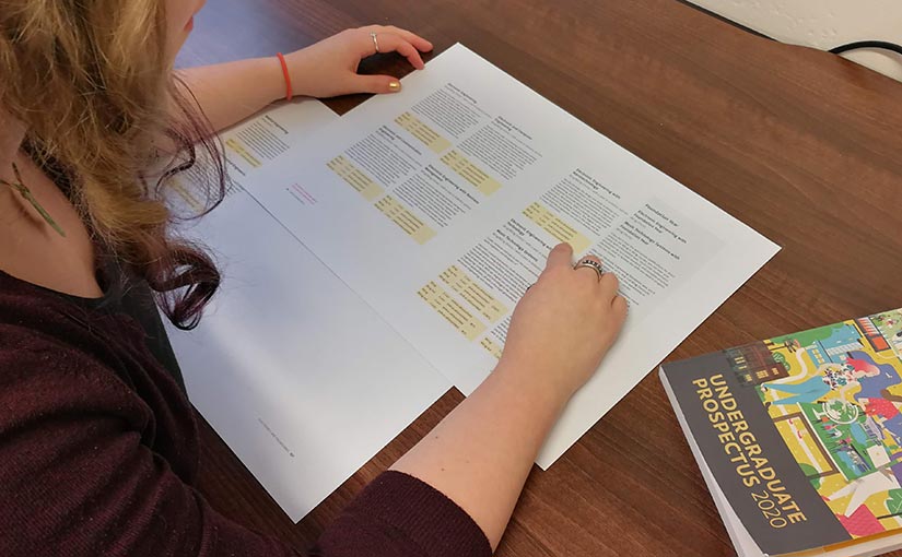
Testing the new designs involved getting the participants to look at print outs of the prototypes. This format of testing is really handy for testing work that is in progress. It doesn’t have to be a finished product to put it in front of people and get feedback.
We gave them four tasks, to establish if they could easily find out:
- What are the entry requirements?
- Does the course allow you to spend a year in industry?
- Who can you contact to ask questions about the course?
These tasks are pretty basic, but they helped us see if the participants could find the key facts of a course without hunting around. We also wanted to know whether the abbreviations and codes we were using for courses were clear to people who weren’t familiar with them.
We then moved on to the front section of the 2020 prospectus. Here, we asked the students to carry out six tasks, including:
- Where is the University’s accommodation located?
- Will you be able to live on campus in your first year if you want to?
- Is there a swimming pool on campus?
- Can you find out the tuition fees for the course you’re interested in?
Finally, we moved on to the discussion. We save this until the end so that we don’t influence any of the task results. We asked the participants about a range of topics, such as:
- UCAS codes (no one understands what they are!)
- Images
- Front cover design
- Prospectuses from other unis
- Amount of detail
- Importance of university rankings
All three of our participants were really helpful. They gave us lots of new information to work with.
Using our findings
Back at the office, we reviewed our findings.
The information gained from testing the subject sections has informed the development of the design. It helped us see which bits of course information stood out clearly, and understand which codes and abbreviations are less meaningful than we’d realised.
Testing the front section of this year’s prospectus showed us that there are no major problems, but that there are some tweaks we can make to improve the order of the sections, and how we caption photos.
For example, from observing the participants trying to complete the accommodation task, we could see they expected to find the information within the ‘our campus’ section. We’re therefore looking at moving the colleges and accommodation sections to follow on from ‘our campus’. This should make them easier to locate both from the contents page, and when browsing from the ‘our campus’ section.

The discussions we had with the participants helped us build a picture of what prospective students are looking for.
They really liked strong images of York students, particularly when they’re engaging in an activity. This helps them identify with students and envisage themselves at university.
“Basically if they [the people in the photos] look happy and they’re doing something then that’s good. Cause if they look happy and they’re not like essentially looking like they’re participating I probably end up thinking ‘you just look fake’.”
“It looks like they’ve got a range of people that go there – everyone’s different. It’s not like you are looking at this and thinking, you know, everyone’s just like a nerd that got three A stars.”
Photos of the campus are important. Students liked being able to get a visual introduction to a university before they visit on an open day.
The colour scheme also makes a difference:
“I think a lighter colour scheme is important because if something’s quite dark then it’s quite dooming.”
All in all, the usability testing was an incredibly useful exercise, and something we’ll continue doing. The next time we test the undergraduate prospectus, we’re going to work with the Widening Participation team with the aim of diversifying the student groups we engage with.
Leave a Reply