In early summer 2025 we will start to roll out a major update to the look of the University of York website. This will align the website with the University’s updated brand identity, which has been appearing across other channels over the last few years. It also gives us an opportunity to apply expertise and insights from within the Communications team to significantly improve the layout of pages and navigation around the site. The initial launch will focus on content published from the Web CMS.
Update (5 June 2025): We’ve moved the launch date back slightly to allow for more time for implementation and testing. Our original target was mid-June but we’re now aiming for mid-July 2025. This post has been edited to reflect that.
Our brand identity
The University’s current brand identity has been rolling out since 2022. Since then, the bold new look – featuring new colours, typefaces, tone of voice and visual devices – has been appearing across the majority of our digital and physical channels. Everywhere you look you’ll now see our updated brand.

Well, almost everywhere. There’s now one notable last piece of the puzzle: the University website.
Receiving over 30 million page views a year, the website is a powerful platform through which we can bring our brand to life. But with tens of thousands of pages, hundreds of templates, legacy code that goes back nearly 20 years, and a small internal team doing the work, it’s a huge undertaking.
The approach we’re taking for the web
We’ve had to think about how we can make the most impact with the resources we have, both within our own team and around the University.
On the one hand, we could have just applied the new colours and typefaces to our existing designs, but this would really only be giving us some of the very surface-level elements of the brand and not drive us far forward.
On the flipside, we could take the approach of completely rebuilding the website from scratch, knocking the whole thing down and starting again. While there is some appeal to being able to wipe the slate clean and get rid of a lot of our legacy content, that approach would require a lot of resource to build things back up again. And it’s a risky approach, as we’d be throwing out lots of good stuff.
What we’ve landed on is what we hope is a sweet spot where we can apply the brand in an impactful way, without generating lots of work for everyone (and for content providers, almost no work at all!).
Here’s what we’re doing:
- The updated brand will be applied to existing content in the web CMS that uses our Digital Pattern Library (DPL) layouts. This will happen all at once, with no changes required by CMS users.
- At the same time, we’re applying our UX design expertise to transform the overall template surrounding the content. The new design will be more usable and accessible, making it easier to navigate and find what you’re looking for while also including core brand messages.
What’s it going to look like?
As the brand has already been successfully rolled out across lots of other platforms and mediums, we’ve been able to take inspiration from where it’s already been effectively used and combine that with our own expertise in designing for the web.
Approach to colour
A key aspect of our updated colour palette is that we don’t have one ‘main’ colour: we’ve got a rich and distinctive set of colours, meant to be used in a bold way. So we’re incorporating the dark blue and purple on every page through the header and footer, with other colours coming through in other elements of the page. This will let us dial up and down the amount of colour being used to best suit the tone of the content.

Template improvements
Probably the biggest change we’re introducing is to our header and site navigation menus (the links that appear in the top bar of every page).
Users of our existing site will probably have noticed some of the issues with our current header navigation, for example how the contents of it change as you move around the site (sometimes in confusing ways), where the ‘more’ button doesn’t actually reveal anything more, or the navigation bar is completely empty.
In our new design we’re introducing global navigation that will appear on every page to make it much easier to get around the main sections of the site and into important pages. We’re also using drop-down menus as an opportunity to bring out our brand tone of voice and say something about who we are, as well as providing quick access to key pages.
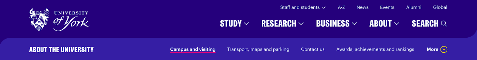

We’re also making improvements to our sidebar navigation. One change is that we’re removing the ‘Other sections’ links as they’re a (confusing) repetition of what’s in the top navigation bar. This will focus the use of the sidebar on navigating around the specific part of the site you’re in. The sidebar navigation will also be moving over to the right hand side of the page, alongside contact and related link boxes, so that we can make better use of the space available to us.

We’ll be getting into more detail about the specifics of navigation in future posts.
Components
Behind the scenes, our templates in the Web CMS are built up from components. Think of these as Lego bricks that can be combined in many different ways to create different types of pages.
We’ve been going through each of our components and redesigning them to incorporate various elements of the brand. As well as colour and typography changes, components give us the opportunity to bring in other design elements such as the ‘framing device’ shapes to create visual interest.
There are usability and accessibility improvements too, such as making it more obvious when a component is clickable.

We’ve also been simplifying and combining some of our components, as they’ve grown organically over the years to the point that we have several that perform similar functions, or have options that are no longer used.
Putting it all together
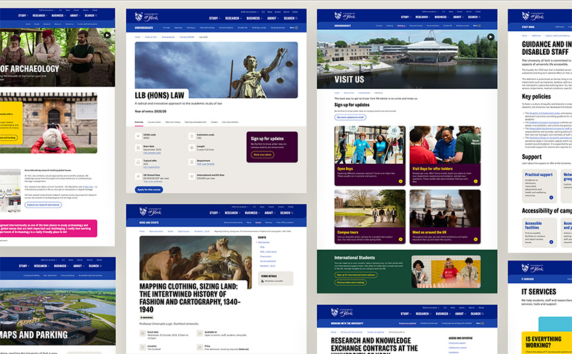
The images below show a series of before and after examples of how things will look when the brand is applied to our existing content, covering some of our common types of pages.
These are indicative as we’re still making minor tweaks, so the final pages may look slightly different.
A key thing worth repeating is that these changes will be implemented with no edits required by page authors, in most cases.
Before and after example: landing page

Before and after example: informational page

Before and after example: course page

Which pages will get the new design?
Part of making a pragmatic decision about how to roll out the brand has been deciding where it will be applied.
If you’re a user of the Web CMS you’ll be familiar with the two different styles of pages currently available: ‘Digital Pattern Library (DPL’) and ‘Classic’.
Digital Pattern Library (DPL) pages are what you’ll see on the homepage and most top-level areas of the site (eg Study, Research). Most new sections created in the last 9 years will have been created using these, and most schools and departments have now migrated to these.
All DPL pages in the CMS will be automatically updated to use the new brand.
Classic pages are ones that use our older layouts, which have been in use since 2007 and date back to the first introduction of the Web CMS at York.
Classic pages will stay as they are in their existing design.
What’s happening to the pages that don’t get the new design?
We’re keen to minimise how much website users will bounce between the old and new look. Right now the differences between DPL and classic pages are subtle to a casual browser – both types of page use the same colours for a start – but this will become a more dramatic distinction once we make the change.
We’ve audited and prioritised pages using Classic templates based on how often they are viewed and how high profile they are within the site. We are in the process of migrating as many of these as we can from Classic to DPL – for example, our list of departments. Projects are also underway to update the staff and student landing pages as these are key pages which still use the Classic layout (many of the pages within the staff and student sections are already using DPL).
After the initial redesign launch, we’ll be working on updating two specific types which currently can only be used in Classic layouts: press releases and staff profiles. These will then be switched in batches to the new design if they’re within a DPL branch of the site.
We’ll post separately about longer-term plans for remaining Classic pages.
Do I need to do anything?
If you’re an editor in the CMS, in almost all cases you won’t need to do anything with your content, the new look will be applied automatically. We would however appreciate your help in checking the preview ahead of launch and letting us know about any issues you spot. We’ll be in touch in due course to invite you to do this if you’re able.
There will be a very small number of pages where content types have been used in non-standard ways – such as directly inserting HTML markup into fields that are intended for text – which will cause some issues when the updated brand is applied. We’ll be getting in touch directly with owners of any pages where this is the case and helping them transition to standard approaches.
If you’re a web developer using code from the Digital Pattern Library in a web application, the new look won’t be automatically applied and your application will continue to look exactly the same as it does now. At a later stage we’ll provide guidance on how to migrate to the new look, and will be keen to have discussions with developers about how we can provide better ways of allowing the Digital Pattern Library to be used in other systems. For now we have a clear steer to focus our efforts on delivering the redesign for the main website, so these discussions will come later and we’re grateful for your patience for now.
What’s happening now?
Since starting the project late last summer the design phase is now almost complete, and we are now in the process of building it in the web CMS.
We’re working with a copy of all the content in the Web CMS so we’re able to see how the design performs when it’s applied to real content.
We’re carrying out accessibility testing and device testing as we go to make sure everything works across all devices. We’ve been conducting usability testing on our prototypes and will continue to do more.
When will the new design go live?
We’re intending to go live with the updated brand in mid-July 2025.
In scope for the launch:
- All Digital Pattern Library (DPL) pages in the web CMS, around 17,000 pages
- The homepage
- Website search
A few weeks ahead of launch, you’ll be able to see how your content looks with the updated brand applied. We’ll provide a way to log issues if anything isn’t looking quite as it should.
What happens after the initial launch?
Getting the new design live will be just the start.
Once it’s live we’ll continue to carry out testing and will be seeking wider feedback to help us iterate on our templates to improve them further.
As mentioned above, two of our content types that are currently in the Classic design will be converted to use the new look: press releases and staff profiles. As with the rest of our approach to this, this won’t require any rekeying of content to move to a new template, it will be an update that’s applied to existing content. This is something we intend to do very shortly after the initial launch as staff profiles in particular account for a large proportion of traffic to Classic pages.
Over the summer we’ll begin work on developing new content types in the Web CMS to address gaps in our provision and give us further ways to express our brand through our web content.
We’ll also start working with owners of other systems to extend the brand rollout further beyond the Web CMS to other digital systems.
How can I stay informed?
We’ll publish further blog posts as the project progresses. You can sign up to get email updates to be notified when there’s a new post via the link in the sidebar.
We’ll also keep CMS users informed via email and the #web-cms-users Slack channel.
If you’ve got any questions, please comment below. We’re super excited by how the new design is coming together and we hope you are too.
Leave a Reply