
Tactile resources are useful to supplement the digital versions of resources, enabling a student to use multiple senses to understand the data, patterns and connections. In Part 1 of our Tactile Graphics blog series, I was just starting to tackle the heatmap resource shown below. Lots of digital tools are good at providing data through cell by cell access, but for an overview of the pattern, including the dendrograms at the top, it’s harder to convey with just one medium alone.
Heatmap example
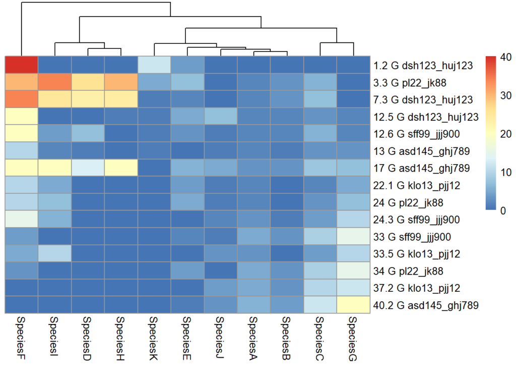
Nothing beats a tactile for a sensory overview – it works in a similar way to a visual. Even if you can explore the data accessibly and digitally (and an Excel sheet coded up with a numerical scale might be just as effective for encoding ‘colour’ information), nothing beats being able to sweep your hand across to get an overview, then narrowing in on patterns or clusters by column or row, then thinking in terms of quadrants, which in this case may be helpful eg top left quadrant has a cluster of cells with a lot more red than top right quadrant), or even in 3×3 grid format so that the data can be discussed or written up in an analytical fashion.
So what was my thought process in making the tactile version of the heatmap?
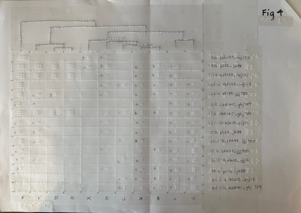
First, I ‘upgraded’ my process to stick the film and labels directly on a sheet of A3 paper. Rather than a thin strip holding two A4 plastic films together (see Part 1), the A3 paper provides a more stable base for the entire resource. I can more easily write in pen on paper directly than on plastic film. This means I can quickly write the information I need for any sighted helpers using the resource with the student. Moreover, the braille labels are less likely to fall off paper than film. However, I would still recommend using double-sided sticky tape if possible. I conquered the curliness of the braille tape with one more step – I straightened out the curly braille tape by ‘scoring’ it – the opposite of what you would do to make ribbon curly. Doing it the opposite way meant I could make the tape stay relatively straight rather than curling up on itself. If you miss this step, the braille labels will try to curl the paper!

My next step was to work out a key to represent the temperature variance. Fig D. isn’t exactly the same heatmap but shows how I had to work out the various shades of blue to red to decide how they would be indicated in braille dots. A heatmap can also be problematic for those with Colour Vision Deficiency. Indicating the areas with simple numbers might be a useful way to differentiate the areas apart. I had trouble telling apart some of the blues and had to go through a very thorough process of comparing the tones cell by cell and numbering them to help me make the tactile!

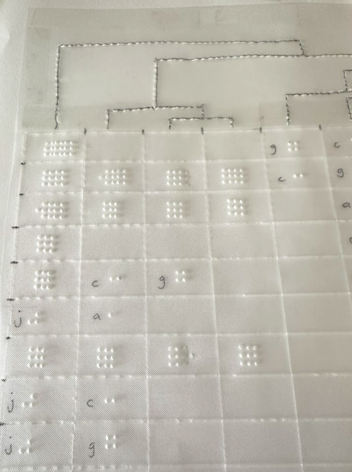
Initially I thought to use braille letters to indicate levels of colour, but this soon became unrealistic. 0-9 is indicated by a permutation of 4 dots. The letter a is dot 1. After that you would need two cells to indicate something like 11. However, 11 would feel like the letter c, which is also made of two dots. I soon gave up on this method and went for grids of dots to indicate how high up the scale the temperature was so rather than ‘reading’ the grid, it would be a more rough and ready sensory resource, where no dots would indicate a cold cell and lots of dots meant a hot cell.
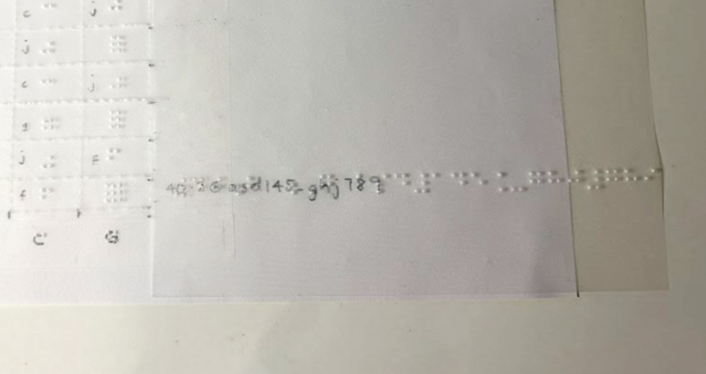
The labels for each row had a number and letter string, for example, 40.2 G asd145_ghj789. I found the characters for each row too long to fit into the tactile, as shown in Fig F. It’s also not necessarily helpful to have the whole long string. The difference between
40.2 G asd145_ghj789,
17 G asd145_ghj789 and
13 G asd145_ghj789,
is simply in the first numerical characters before the letter G. Rather than making the student read a whole string of characters after the letter G, I opted to only put the first 2 to 3 characters eg 40.2 G asd. The longer characters could be put into a legend if it was necessary to do so.
Narration
Another thing I added to the heatmap for the student was an RFID sticker to use with a Penfriend.

With the RFID stickers, the student’s helper or tutor can help to record a narration about the heatmap on the PenFriend that she can go back to anytime she wants to explore this. She can play back the recording while exploring the map with her fingers. This helps with aligning words to ‘pictures’ and avoids overloading one channel for cognitive processing (Mayer & Moreno, 2003). The graphic should be described from ‘general to specific’ (Image Description Guidelines, 2015), giving the student a chance to gain an overall perspective of key traits before drilling down to more detail. Detail can be described in segments, starting with the top left quadrant and working clockwise, for instance. This is a good way to emulate how you might want data described back to you so you can discern if the learner has understood things correctly.
Although these RFID stickers are a great idea, it can be hard to tell they are even there when they are stuck down! To help her detect the presence of the sticker, I recycled some screw hole cover stickers that were languishing in a stationary cupboard – these were thick enough to be easily perceivable and when added to top right of the resource, they provided a clear indicator that there was an RFID label on the graphic and she could point her Penfriend to it to hear more about the heatmap. Gem stickers or anything slightly 3d would have been equally good, but the screw hole cover stickers were a good fit as they were much flatter, stiffer and stickier than gem stickers would be. However, gem stickers do add a bit of bling to the resource so choose whatever works for you and your student!

Art and craft
Don’t be put off by how much skill it might take to create some of these tactile resources; anything you can make to bring additional information to life is appreciated. Fig I shows a quick outline map created by the tutor to explain to the student how the outdoor sampling was going to happen. Various areas on a slope were indicated by pasting kitchen roll and paper straw wrappers on a sheet of paper to help with ‘visualising’ what was going to happen. The student was so impressed by the effort made by her tutor that she kept these to inspire others who might be making things for her. Every little bit of effort we can make is appreciated and goes a long way!

As Alice mentioned in Part 2, do bear in mind that any tactile resource should be used in context and in conjunction with a learning opportunity. Some items are less useful as an independent learning resource, especially if there hasn’t been an explanation of how to navigate the resource and what to expect on a page. After an initial introduction, they can be very helpful, especially when supplemented with audio via the Penfriend, or while the actual data is being interrogated digitally with a screen reader. Tactile resources may be more familiar for students who studied braille than students who lost their sight more recently.
One more thing to bear in mind is whether your learner has any aversions to certain textures. This is going to be useful to know in advance rather than spending too much time creating a resource only to find it’s not usable by the student.
Going digital
As I looked for more resources around accessible heatmaps, I came across an MIT open source library called Olli. This converts visualisations into keyboard-navigable tree structures of information, allowing a user to drill down at varying levels. (The MIT Visualisation Group has several publications that are worth a look.)
Although this is the kind of work that is absolutely essential and so useful for making information accessible to all, learning isn’t just about absorbing information; it’s about interacting with, creating and evaluating as well. As Natalie Curran, one of the co-authors of An Accessible Maths Journey, said to me, students want to do more than just passively receive information. They need to be able to make notes, see what happens when they change something, make their own versions and interpret those results and so on. They need to have the agency and the means to run their own investigations and we need to find ways to enable this.
One of our upcoming blog posts will delve into our VI student’s journey into learning RStudio with the BrailleR package. RStudio is widely used at the University for data analysis and visualisation. Adding the BrailleR package means that the outputs are made accessible to screen readers and braille users, and we’re finding it also makes for a great accessibility checker for anyone using RStudio to generate charts and graphs. By learning to code, our student is able to run their own interpretations and analysis of the data. Having a foundational understanding of what boxplots and heatmaps look like helps her to understand what she is generating. I don’t expect to have to create multiple heatmaps or tactile graphs for this student in the future, now that the foundation has been laid for her interpretation of the digital data. As she progresses on her learning journey, access to a braille embosser is going to make a big difference in our ability to turn around timely resources to match her learning pace.
Braille embossers, third party suppliers and qualified staff
From discussions with others in the HE and FE sector, what is clear is that most Universities are not equipped with the right technologies, know-how and expertise to support the increasing numbers of VI students joining us. Thanks to the Equality Act 2010, we are getting an increasing number of VI students who are making it successfully to higher education (HE). However, we don’t usually have a QTVI (Qualified Teacher of Children and Young People with Vision Impairment (QTVI) in our midst. Young people may join us from specialist colleges who are then expected to navigate HE based on everything they’ve been taught up to that point. What I’m finding is that there can be a big gap and there is limited continued support for that young person – the council don’t cover support for a VI person at Uni, and the Uni may not have the qualified teacher who can help. Hence we seem to be learning as we go. I know we can outsource the creation of tactile resources to transcribing companies, but these often come back slightly out of context, and without any input from the learner or even the tutor. It can also be very expensive and suffer from a significant time delay. Through the DSA, VI students can access external Assistive Technology Trainers but these people cannot help with Uni-specific systems or software.
I have no answers to the conundrum but I’m grateful:
- To find others who are on the same journey like Ros Walker at St Andrews and others on various mailing lists,
- For Perkins School for the Blind in the US and their amazing website; they have bothered to capture so many articles and guides that can be delved into at the point of need,
- That the tutors and Disability Services are so quick to respond and support our VI students,
- Our VI students are willing to teach us all they know to enable us to do our jobs of supporting them.
The journey continues and we will be pleased to hear from anyone with ideas of how to gain more recognition for the gap in support for our VI students in HE and more concerted efforts to close that gap.
References
College readiness. (2021, June 14). Perkins School for the Blind. https://www.perkins.org/resources-stories/college-prep/
Image Description Guidelines. (2015, July 31). DIAGRAM Center. http://diagramcenter.org/table-of-contents-2.html/
Mayer, R. E. and Moreno, R. (2003). Nine Ways to Reduce Cognitive Load in Multimedia Learning. Educational psychologist, 38 (1), pp.43–52. [Online]. Available at: doi:10.1207/S15326985EP3801_6.
Related posts
Creating Tactile Graphics for VI students – part 1
Creating tactile graphics for VI students – part 2
Reflections on our Supporting visually impaired students workshop.
3 thoughts on “Creating tactile graphics for VI students – part 3”