As we head towards the start of semester, it’s a good time to prepare for our students. There will be lecturers new to teaching students who are vision-impaired (VI). This blog post aims to review the tips, support and resources available to help you with your teaching.
1. Make digitally accessible resources
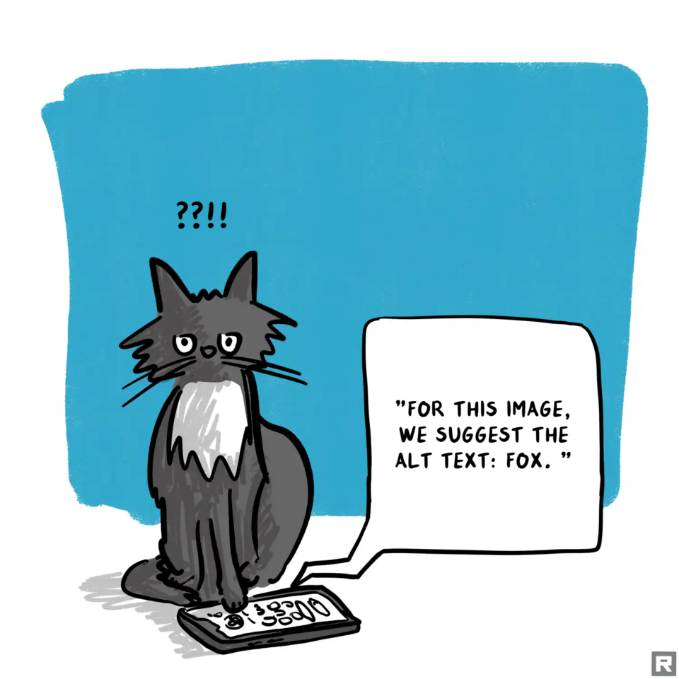
The first step is to ensure all your resources have been through accessibility checkers and corrected to ensure they have
- good heading structures (start with a H1 and don’t skip heading levels)
- text is styled using the Styles menu (eg normal, H1, H2 etc)
- alt text and/or good captions for any images
- descriptive hyperlinks (not ‘click here’)
- tables have header rows and are only used for data, not layouts
- colour contrast is good (does it still work if it’s in greyscale?)
Attend Creating Accessible Documents and Presentations workshops if you need to boost your confidence on any of the above, or consult our Digital Accessibility Practical Guide and Digital Accessibility A-Z.
2. Provide resources in advance
Plan to provide these to any VI students a few days in advance. If any resources need to be converted to tactile formats, you’ll need to plan for this to be done even earlier.
Having digital resources means your students can prepare for the session. It can mean they can zoom in to a screen to follow along with your slides or more easily make notes along the way.
3. Set up Reading Lists and tag them
Any readings should use the Reading List tool on the VLE and be tagged with Essential, Recommended and Background to ensure students will receive alternative formats for their essential readings if this is on their Student Support Plan (SSP). You’ll also need to identify individual items in your reading lists using the tag ‘Alternative Format Request (SSP)’. Follow the guidance on supporting students with a print impairment.
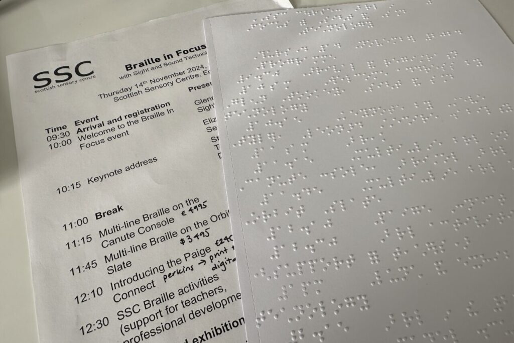
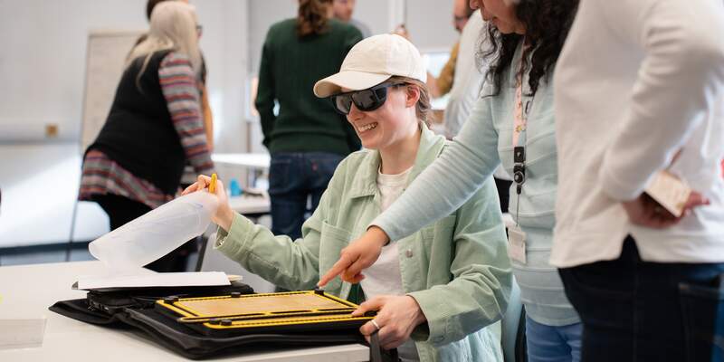
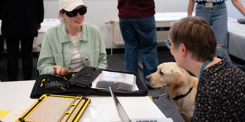
4. Prepare tactile resources if needed.
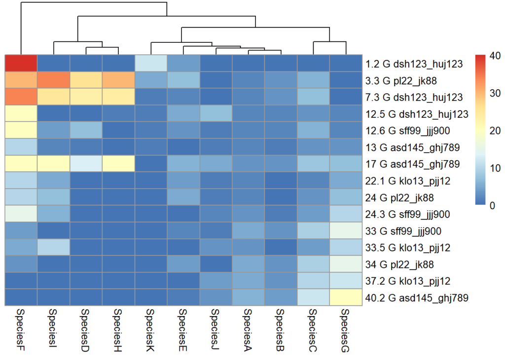
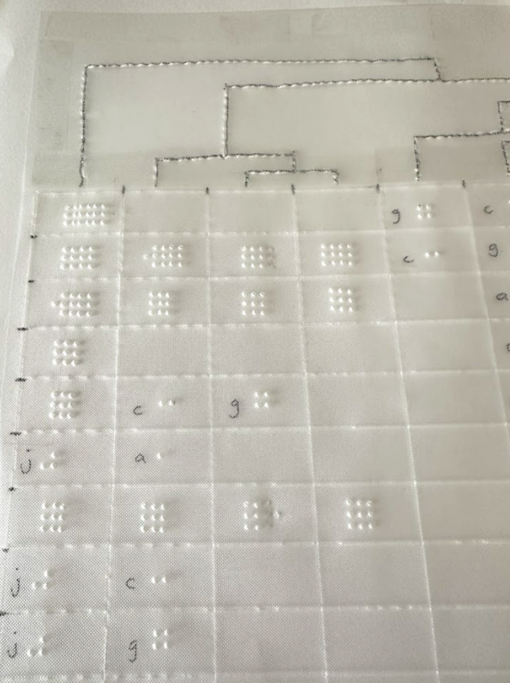
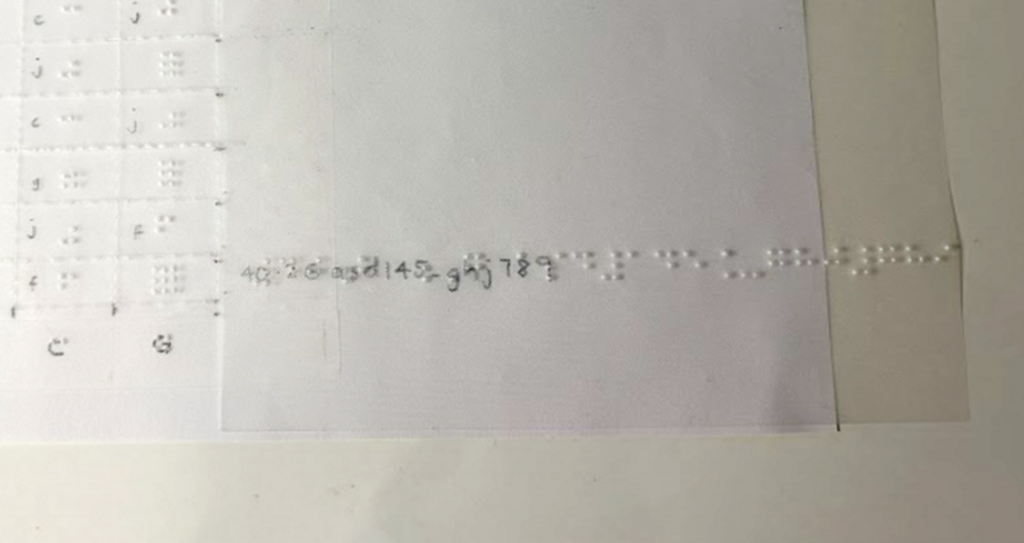
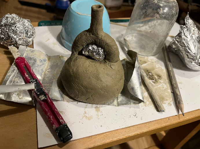
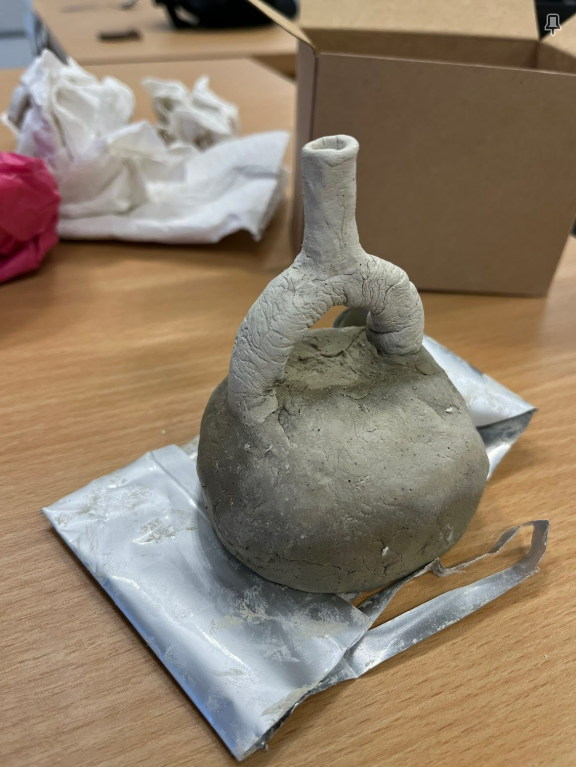
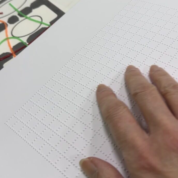
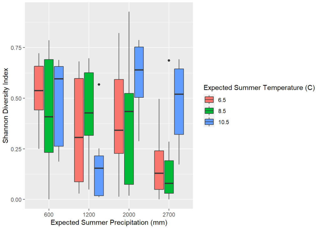
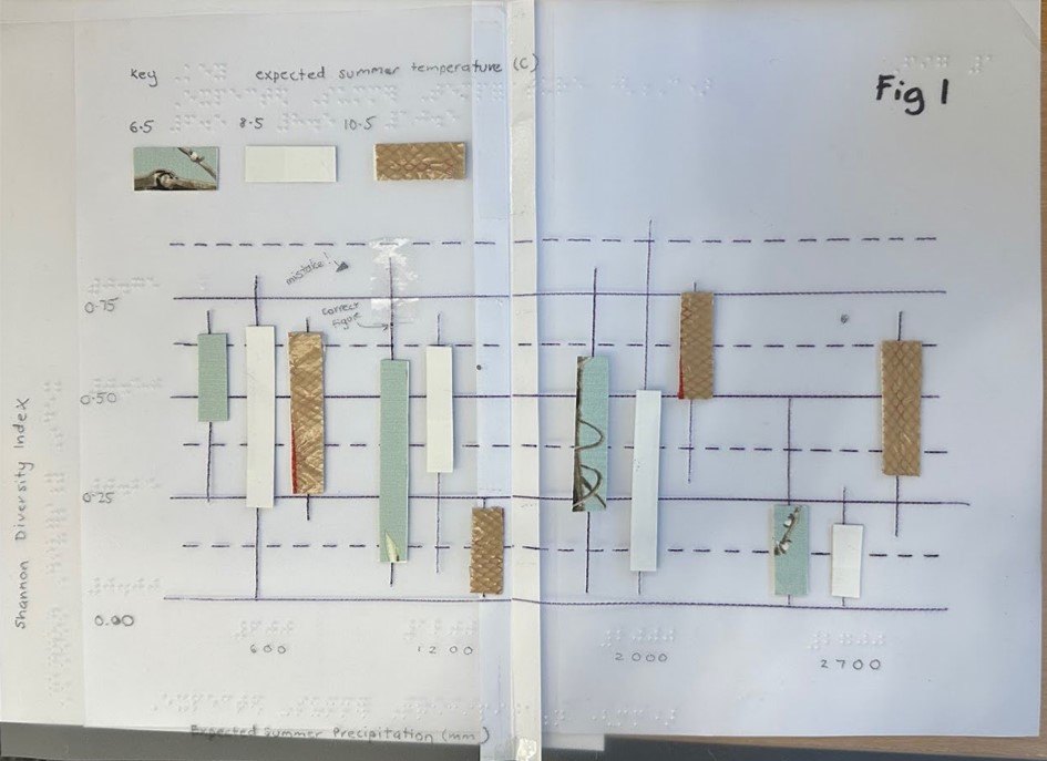
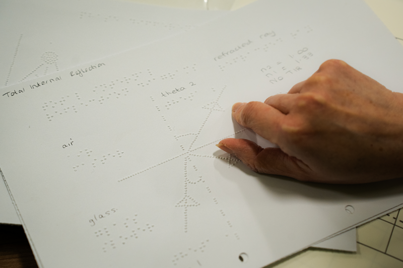
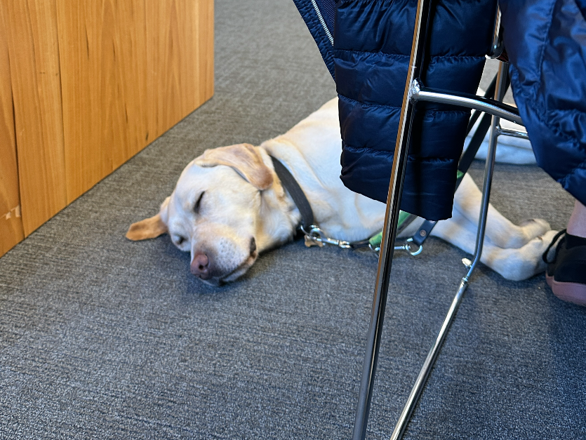
Tactile resources can help blind students to understand content that may otherwise take too long to describe, as illustrated by the tactile dental identification resource shown below with braille.

Resources can be prepared through the following methods:
- outsourcing to a transcription company – consult Disability Services on this approach
- embossed using our own SpotDot embosser at the library
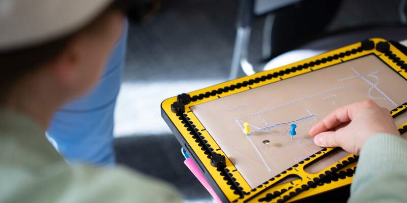
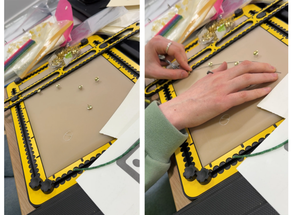
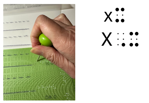
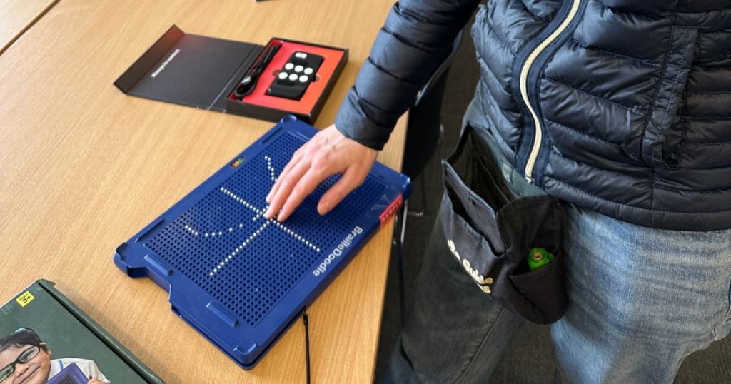
- created using embossing film and a geometry mat (your department should purchase a mat and some embossing film). A braille labeller helps to label such resources. Your student may have their own geometry mat (like the Tactipad) and a labelling slate. See Tools for creating tactile graphics.
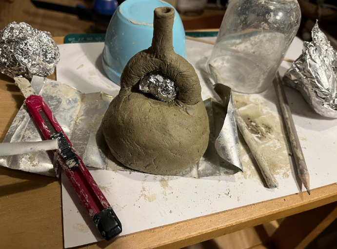
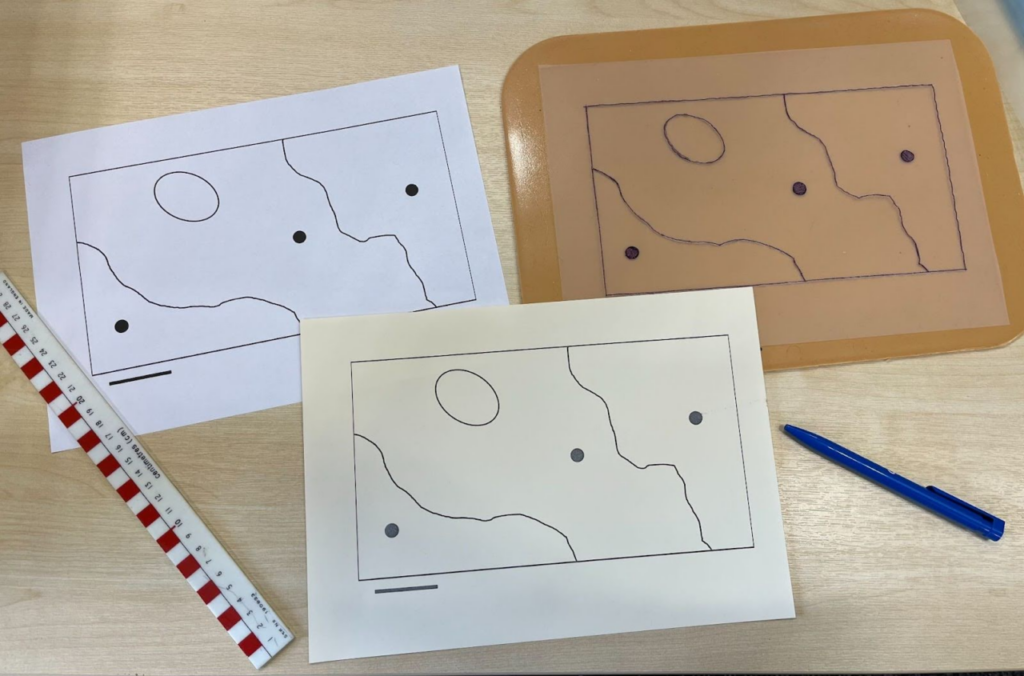
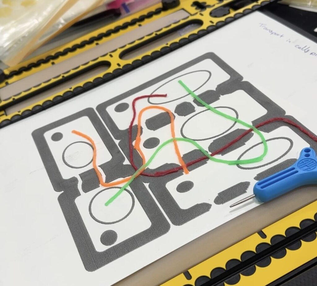
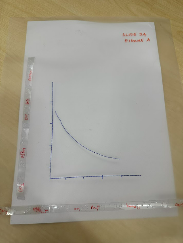
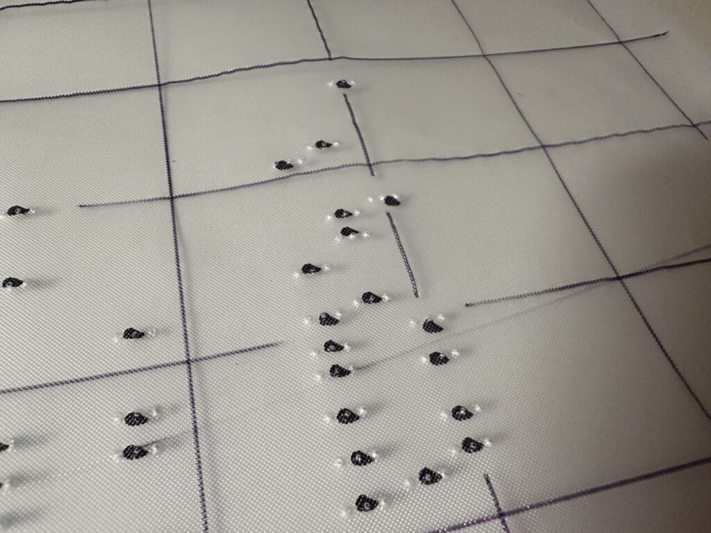
- created using any materials that can provide texture, as illustrated by the ‘map’ of sampling areas made by a tutor below.

Find out more about creating your own resources through our blog posts:
We’ll be adding another blog post about accessing the SpotDot braille embosser at the library soon! We can also use the Creativity Labs 3d printers and the Cricut machine where relevant. If you need to talk through your ideas, feel free to contact the Digital Accessibility Unit.
Elva, a lecturer from Biology, had this to say about her experience of making tactile graphics and teaching a blind student:
“The tactipad thing was fantastic, but a good tip for future staff (which you probably already have as I think it came from you!) would be to flag the cognitive load involved for the student in interpreting the outputs, so staff need to be very selective in which diagrams to supply this way. Also, it requires some advance planning, to make sure that the images are generated the week ahead of the teaching and supplied to the student/s – this did require a bit of extra work on the part of the MO, to make sure the kit got passed around from staff to staff a week ahead, with the instructions etc, and to arrange the handover (both of the kit to staff, and of the diagrams to the student/s) at the right intervals.
Other thing is that I found that when live lecturing or doing workshops, when I put graphs up on the screen, I spent a little more time on explaining the axes verbally and on describing the overall trends than I might have done in the past, which meant I had to keep a careful eye on the overall timings… but I think that doing this actually benefits everyone, whatever their sight status, because it draws attention to the key information very clearly. (The student) did comment that she found this very helpful – but I think it benefitted everyone really.”
5. Describe the screen and your mouse actions clearly
As Elva suggests above, spending a bit of time explaining what’s on the screen helps everyone. Just as we suggest not using ‘click here’ for a hyperlink, saying things like ‘click here’ and ‘type here’ is not helpful. Imagine someone listening to a recording of your teaching session, like it was a podcast. What would they understand from listening back without seeing what’s on the screen? Being more descriptive means getting in the habit of saying things like “the button to open the software is in the top right area of the screen”. This could be helpful for students sitting at the back of a lecture theatre or anyone squinting at a recording of the lecture on their mobile phone!
Another good tip is to make your mouse pointer a lot bigger and brighter. On Windows, go to Accessibility settings > mouse pointer and touch, and set a bigger size for your mouse pointer. You can also choose a custom colour to make your mouse pointer stand out.

6. Face forward
Keep facing forward when you are talking. The change in direction of your voice if you walk around the room too much, or if you turn to face a board, can make it harder to understand you. This tip can help our hearing-impaired students too.
Always wear a mic and repeat any questions that students have asked by speaking into the mic.
7. Use the visualiser or share screen
If you are likely to handwrite during your teaching session, aim to use the visualiser with a good medium nib pen in a dark ink. Write bigger than your normal handwriting and keep the paper portrait to confine your writing to a narrow column.
If you are ‘canceling out’ any parts of an equation, be specific about what is being cancelled, not using words like ‘here’ and ‘here’.
If you are highlighting any part of a handout or diagram, again, be specific about the area of the handout or diagram you are drawing attention to.
If you have a screen magnifying student in your class, they may point an ipad or phone at the screen to take a picture so they can zoom in to see more clearly.
In some classrooms, you may be able to log in to Zoom and share your screen with the student. This can be very helpful for any screen magnifying students to follow along. Speak with the student beforehand to determine if this will be helpful – don’t assume!
Ideally you should have a digital copy of your notes that you can provide the student with before a lesson, even if you are then writing them out in your live teaching. Digital handouts help everyone! Maybe you can turn them into a gap fill instead to help all students with their note taking.
See our guide Live teaching for students who screen magnify.
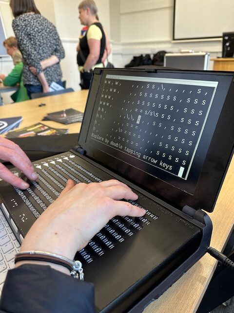
8. Student tools
Your student may have tools like the Tactipad, a braille labeller or a Penfriend. (See Tools for creating tactile graphics.) By collaborating with the student, you can help create effective study materials tailored to their needs, rather than making assumptions about what will be helpful. Always follow up with students to check if resources provided are working for them.
JAWS recently announced an upgrade that uses AI to help describe images called Picture Smart AI. Although your student may have access to such tools, only you will know the true context of any diagrams and images you provide. Do your best to provide useful summaries rather than expecting the student to get these for themselves.
9. Feedback
It’s a good idea to learn from the student along the way and to learn from colleagues who have taught before you. Make sure you check in with students to ensure your materials and teaching practice are working for them. The earlier you can make adjustments, the more likely it is that you will help your student to succeed in your module. Share any successful tips with us and with others in your department. As Elva noted, one key tip is to pass any knowledge gained to others in the department so the student doesn’t have to keep repeating themselves.
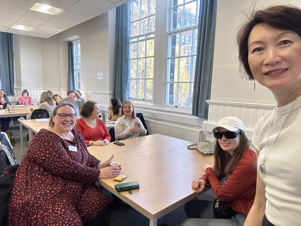
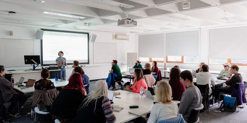
Workshops
The Digital Accessibility Unit will run workshops through the year to gather staff and students together so we can continue to learn from each other. Our next Preparing to teach VI students workshop is on online on 10 September (for UoY staff only). We will make a recording and share it in another blog post.
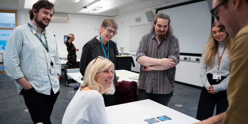
We’ll organise another face to face workshop once Semester has started so people can interact with tactile materials and ask any further questions. Read about our previous workshops.
Resources and Support
- Live teaching for students who screen magnify
- Creating Tactile Graphics part 1, part 2, part 3
- Tools for creating tactile graphics
- Creating tactile graphics with a digital embosser (coming soon)
- Visual Studio keyboard guide, RStudio keyboard guide (draft)
- FAQ – Supporting VI students
Learning to teach more inclusively takes practice. Be patient with yourself and aim to develop your skills and habits over time. If you have a question, feel free to add to our Frequently Asked Questions document.
External resources
- Joy, L., Curran, N., Webb, C., & Capinski, M. (2024). An Accessible Maths Journey. MSOR Connections, 22(1), 43–53. https://doi.org/10.21100/msor.v22i1.1455
- Hewett, R. (2018). Supporting the achievement of learners with vision impairment in higher education. National Sensory Impairment Partnership/Department for Education.
- Delivering accessible learning, a guide for FE – Thomas Pocklington Trust
- Understanding vision impairment – Thomas Pocklington Trust
- Paths to technology – Perkins School for the Blind