In this major revamp, we’re making IT Services’ web pages easier to use. As well as being some of our most popular sets of internal pages, they’re also super complex. We’ve gone back to the drawing board to investigate what users really want.
This is my first time posting on this blog so I’ll start by introducing myself. I’m Harriet 👋. I’m part of the Content Design Team in Communications. As a web content developer, it’s my job to design and transform online content. I started at the University last year specifically to work on rebuilding the IT Services web pages. I’m leading this highly collaborative project, working alongside the IT Services team and others to plan and deliver an improved experience.
What’s it all about?
Every single member of York uses IT services. From email to wifi, there are hundreds of tools and systems enabling us to work, study and research. For every one of those, there’s usually at least a web page or two. And as you might expect from a technical service, there’s also a lot of guidance, such as how to access a system or how to troubleshoot issues with it.
Across the IT Services section alone, we’re talking over 600 pages of content. But that’s not all. We discovered more IT content across three other sections of the University website. Plus, beyond our Web CMS, we found IT-related content over eight other web platforms such as Salesforce, Google Sites and LibGuides. Before anything else, we needed to scrutinise what categories of content should be published where and why. This helps us be consistent about what we publish and where, and decide what should stay and what should go. After that, it was time to map the rebuild for the CMS side of things.
The IT Services section of the website is home to some of our most viewed internal-facing pages, receiving over 1 million views a year. Despite its popularity, years of growth were taking a toll. The bloated content was hard to navigate and maintain, and the older ‘Classic’ templates looked tired. To help staff and students find the services and support they need, we had to change that. Cue the content strategy!
Content strategy toolkit

Here in the Content Design Team, we love to plan. It can feel a little daunting but a good plan is vital for mapping out changes, juggling priorities and keeping track of what’s important. Here are some of the tools and techniques which helped us get from planning content to publishing it:
- Content audit – a listing of all web pages in scope. We used it to assess content quality, measure analytics performance, and plan next steps.
- Competitor analysis – we reviewed 13 competitors and industry leaders to spot trends and best practices.
- Stakeholder interviews – we met with 20 colleagues in IT Services to understand departmental needs first-hand.
- Steering group – we scheduled a regular catch-up with key stakeholders every three weeks. This proximity helped resolve queries, set actions and move the project along.
- Content mapping – we led a workshop with stakeholders to understand content categories, where each should be published and why.
- User research studies – we undertook user testing of our pages and competitors, using heat mapping tools and tree testing to test our new navigation menu and labels. The findings helped us plan effortless, logical designs.
- Site structure mapping – we used a mind mapping tool to plan the new site hierarchy and review content relationships.
- Focus days – we scheduled whole days for content planning, giving us dedicated time for deep focus and collaboration.
- Feedback rounds – once drafted, stakeholders and web specialists vetted the content over several feedback rounds. They checked for accuracy and helped finesse the content.
- Governance plan – to help maintain content, we’ve confirmed information providers and approvers (IPAs) for every branch section and we’ve documented the process for requesting edits. To learn more, see the governance plan (staff only).
Putting plans into action
Because this is a complicated project with lots to unpick, we’re rolling out the changes in phases. The first of which went live in February. Here’s a rundown of the five big wins to give you a flavour of all things new and shiny so far 🤩.
1. Simple navigation

- Reduced the navigation menu from 21 items to just seven to help make information easier to find.
- New labels separate the key strands of IT Services’ content. They avoid overlap between the sections, helping everyone to take confident next steps.
- Bookmarked the start and end of the navigation menu with the most important sections: ‘Guides and help’ and ‘Contact us’. These both lead to self-service guidance and how to get support, which are core user needs.
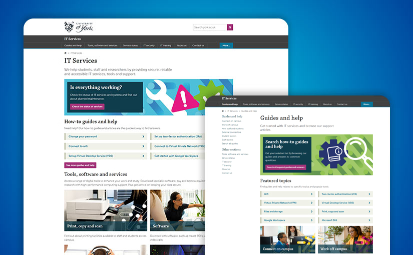
2. Revamped landing pages
Before

After

- Redesigned three key entry points into IT Services content. The content is more visually engaging and laid out in order of hierarchical importance. The pages include the IT Services landing page, student landing page and staff landing page.
- Rebuilt all phase one pages using the Digital Pattern Library web templates.
- Added sleek and vibrant graphics, designed by our in-house Creative team.
3. Clearer user journeys


Supported by the simplified navigation, we’ve built two new signposting pages. These work by chunking the content into themes and making the site easier to navigate. On them, you’ll find collections of popular and important content.
- In Guides and help, you can find solutions to the most common queries, regardless of whether they are published on the CMS or another platform.
- In Tools, software and services, you can find digital tools and support to enhance your work, study and research. We’ve also implemented a searchable table, so you can quickly find what you need, rather than scrolling through a very long list.
You’ll also find signposts at the end of most of the newly launched pages, which lead to related content.
4. Simple contact information
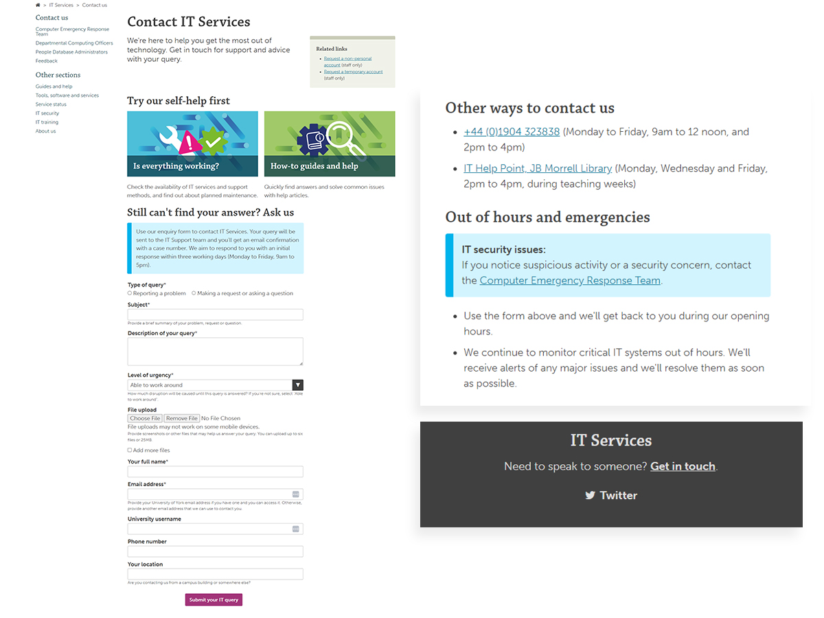
IT queries can often be time-sensitive and therefore stressful. Think log-in issues or misbehaving technology amidst a looming deadline. Being able to contact IT Services is crucial.
In our content audit, we discovered multiple web pages with contact information. Each of them slightly different. To make it clear and simple, we needed to streamline and tackle the redundant information.
- Instead of duplicating the content across various pages, content now links to the contact page. Having one source of truth makes it much easier to update and helps everyone access accurate information.
- Embedded a contact form to make it more efficient to request support.
- Added a footer across the branch, signposting to the new contact page. It’s common practice on web pages and helps us meet expectations.
5. Get to know IT Services
In the original structure, there wasn’t anywhere to shout about the impressive projects being led by IT Services or what they do. The new About section plugs this gap. It also appeals to prospective employees who want a sense of workplace culture.
What’s next?
Phase two is another large piece of the puzzle. We’re continuing to collaborate with IT Services and rebuild more content. We’ll be designing a service catalogue (a collection of all the tools they offer in a standardised usable format) as well as working on equipment, facilities and IT accessibility web pages. We’ll iron out the details of this over the coming months, so watch this space for more shiny new content.
After phase two, we’ll be working on the IT security and training pages, and wrapping up the project.
👀 Fancy a nosey? Explore the changes so far at york.ac.uk/it-services.
Leave a Reply