-
Content Design team round up: April and May 2026
Here we are in May. Spring is finally here, and we’ve been spring cleaning and ensuring our content is up to date and fresh across a range of projects.
-
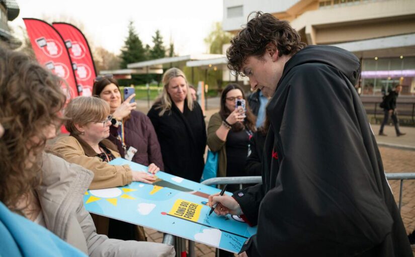
Brand and Creative Services team round up: March and April 2026
Seeing Radio 1’s Greg James signing our team’s artwork was just one of many highlights of the past two months. Here are some more…
-
Digital Platforms and Developments April 2026 update
HR pages go live, getting close to completion with blog theme update, reviewing the analytics for our site-wide navigation and more.
-
Digital Platforms and Developments March 2026 summary
Getting closer to launch for the HR web rebuild, blog platform theme progress, news branch migration, staff listing improvements and more.
-
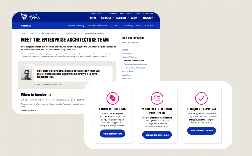
Enterprise Architecture: making a technical process easier to navigate
We’ve been working to demystify a tricky technical process. By sitting in the same room with our stakeholders and designing around user stories, we’ve clarified a complicated process and made…
-
Content design team round-up: March 2026
A short and sweet update to sum up what has been a packed couple of months since my last update in January. HR web migration A team of us migrated…
-
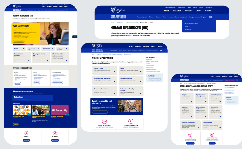
New HR web pages now live
Over the past few months, we’ve been working on migrating the HR web pages from a legacy system (Dreamweaver) and into the main University website and our central web content…